Trophies play an important role in the lives of individuals and organizations. From awards at employee appreciation night to the Oscars, they are valued recognitions of achievement from one’s peers and industries.
Most trophies are standard issue: a gold figure on a black base, or a crystal block with a logo etched into the face. They are ordered from catalogs, engraved quickly, and built to be familiar rather than memorable. Some are expensive but still look generic; some are made from recycled or low-cost materials.
Few trophies reflect the creative designs, flowing contours, vivid colors, and visual appeal as trophies acknowledging media accomplishments. Some are interactive; some tie the shape directly to the field the award represents. Unlike any other industry awards, they become objects of art in themselves. Since trophies sit on desks, appear in photos, and stay visible long after the ceremony ends, design and form are vitally important.
These trophies are sponsored by design organizations. The best ones treat the trophy as part of their discipline.
A’ Design Award Trophy
Source: A’Design Award
The A’ Design Award trophy is given for design excellence within 100+ categories.
It is built around a cutout letter “A” with a hollow center and angular cutaways. It has no separate base or plaque, so the shape carries the entire object by itself. The form is compact in the standard version, but scales up into larger display pieces, including a red metallic 5XL edition that appears frequently in event photography. The open geometry gives it a more architectural look than a typical ornamental award.
Based in Italy, the award recognizes design excellence across more than 100 categories, including architecture, product design, and graphic design. Because the award covers so many categories, the trophy has to represent many disciplines at once without favoring one. The abstract A shape helps keep the trophy recognizable while allowing it to work across many different disciplines within the design field.
Earlier versions were produced with stainless-steel 3D printing. Newer versions use jewelry-style casting, hand polishing, and electroplating, which gives the surface a finer finish and removes the slightly rougher texture of printed metal. The Omega Particle does that by keeping the same core silhouette across multiple manufacturing methods and sizes, so the award can be both recognizable and adaptable.
The manufacturing shift changes the way light moves across the object, making it read more like a cast sculpture than a machine-made plaque.
National Design Awards by Cooper Hewitt

Source: Year of Glass: Cooper Hewitt’s National Design Awards / Sarah Barack on June 29, 2022
The National Design Awards trophy by Cooper Hewitt began in 2000 as a twisted asterisk in silicon carbide. In 2010 it was recreated in a stainless-steel composite by Smart Design, and in 2011 the Corning Museum of Glass began producing the current glass version through its GlassLab initiative. The switch from metal composite to glass made the piece lighter in appearance and more luminous, which fits a museum-level award.
The glass version has deliberate striations that give it a raw, hand-finished look instead of a perfectly polished, bubble-free surface. The top is cut at a 50-degree angle so the surface catches light differently and lets the winners see their own reflection when they peer into the glass. That detail makes the object more interactive than a standard block of crystal.
The award recognizes design excellence across multiple fields, so the trophy has to work as a unifying symbol rather than as a niche signifier. The asterisk form fits that purpose because it does not lock itself to a specific object or profession. It acts as a mark or reference symbol, which suits a national honor for work with public impact.
Awwwards Trophy
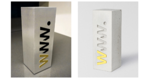
Source: Cristaux / Awwwards.com
The Awwwards trophy has shifted toward a heavier, more brutalist style in recent years. The current version uses a cement-and-concrete mix with recycled rubber, giving it a dense, matte surface that feels very different from polished acrylic or glass. A gold “W” detail keeps the branding visible without taking over the design.
The result feels more architectural than decorative, almost like a physical counterpoint to the digital work it represents. Its rough, matte texture gives it a grounded presence, which contrasts with the glossy look people usually associate with web design.
The award recognizes web designers, developers, and agencies, and its main honors include Site of the Day, Site of the Month, Developer Award, and Site of the Year. The physical trophy sits inside a larger system of public recognition and judged achievement, so it has to represent a living web culture rather than a one-night event. The brutalist form fits that ongoing, material-focused identity better than a shiny trophy would.
Good Design Award Trophy
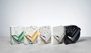
Source: Good Design
The Australian Good Design Award trophy is a compact block built from one kilogram of compressed Australian post-consumer plastic. An Australian-sourced extruded aluminum tick runs through the core, and the winner’s name is engraved directly into that metal instead of being added as a separate plaque. That makes the name part of the structure rather than a label screwed on after.
The form is clean and engineered. It looks like a designed object first and a prize second, which suits an award centered on design excellence. Everything is sourced and made in Australia from recycled and recyclable materials, and with around 1,000 trophies in circulation the program has diverted roughly one ton of plastic from landfills and the ocean.
That material story is part of the object itself, not just a background claim. The trophy does not need ornament or a complex silhouette to feel valuable; it depends on material, edge, and finish. The result is a straightforward award that looks consistent on a shelf and holds up well in photos.
Dezeen Awards
Source: Dezeen Awards
The Dezeen Awards trophy changes from year to year, so there is no single fixed look. The inaugural trophies were made by Atelier NL from London clay, the same clay the city’s traditional yellow bricks come from. Each one was shaped like a brick, bent into a letter D for Dezeen, dried for fifty hours, and kiln-fired at over 1,000 degrees Celsius.
Another version used a sustainable papier-mâché-like material called Paper Factor, giving the object a handmade, earthy quality with a rougher surface. The brick version is especially effective because it ties the award to construction, material, and place. The Papier-mâché version reinforces the idea that the trophy is a design commission rather than a stock award.
Dezeen is a design and architecture platform, so its award objects function as small editorial statements about thoughtful material practice. Marcus Fairs, the founder, said trophies are usually “shiny and brash,” as they wanted something different. Winners noticed: Alex Mok of Linehouse said the brick trophy stood out because the design and materials were tactile and thoughtful.
Architecture awards should be especially careful about their trophies because the field is built around structure, material, and proportion. A weak trophy is obvious here.
Archisource Drawing of the Year
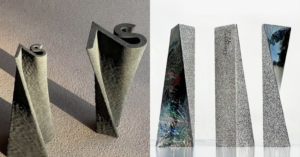
Source: archisource.org
The Archisource Drawing of the Year trophy changes material every year. One version used recycled plastic from Smile Plastics, another used 3D-printed quartz sand from Bavaria through SANDHELDEN, another used sustainably engineered flexible wood from Dukta, and another used waste eggshell and discarded pen shell from Nature Squared. The form follows the qualities of each material instead of forcing every edition into one fixed shape.
That makes each trophy read like a material sample that has been turned into an award. The surface, weight, and finish shift from year to year, which keeps the object from feeling repetitive. Each material brings its own texture and grain, so the trophy does not look like a catalog piece.
Archisource has maintained this approach for across 4 awards, which is unusually consistent for an awards program. The collection reads as a running argument that discarded material can become something worth keeping. That consistency gives the program a stronger identity than a series of random trophies.
Arch Design Award
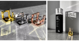
Source: Arch Design Award
The Arch Design Award trophy takes its shape directly from architecture, using the arch itself rather than a generic symbol of prestige. The metal version appears as a compact, cube-like form made from brass, stainless steel, and copper, while a crystal version also exists. The metal version feels like the concept in its strongest form. The arch is one of the oldest and most recognizable structural forms in architecture and is still in use everywhere, which makes its symbolism feel immediate rather than constructed. It does not need to borrow meaning from elsewhere; it is already built into the form.
The result feels more like a miniature architectural artifact than a standard trophy. The brass, steel, and copper versions each give it a distinct, crafted surface rather than a mass-produced finish. It’s a deliberate choice that aligns with the discipline
These awards often require objects that do more than sit on a shelf. The best ones add a feature that connects to the category itself.
D&AD Pencil
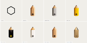
Source: D&AD Pencils
The D&AD Pencil looks exactly like the tool it is named after: a literal pencil elevated into an award object. The system includes Yellow, Black, White, Wood, and Graphite pencils, and the different finishes and sizes map directly to the award hierarchy. That makes the award level obvious without needing extra labels.
Where most programs reach for metal finishes and muted, serious tones, the pencil stands out wherever it is placed. It exists because the original trophies were too costly and fragile, so the pencil became the practical and symbolic replacement. The form works because it is instantly recognizable and does not need ornament to feel prestigious.
The award began in London in 1962, when designers and art directors came together to raise standards in creative communication. Over time, the recognition system expanded to include White Pencils for creativity that does social good and Impact recognition tied to positive change. The pencil is a visual record of how the award’s values have broadened over time.
C de C Awards
Source: Sustain Awards / C de C Awards
The C de C Awards trophy is restrained and minimal, with a form that relies on proportion and finish rather than extra decoration. It is made by Sustain Awards from recycled materials and produced in Spain, which gives it a contemporary material story without making it visually loud. The surface is smooth and tight, and the object feels solid in hand.
The trophy is designed to feel worthy of display even before anyone knows what award it represents. It does not try to be clever or theatrical, which suits an award that already carries status through the organization behind it. The name C de C refers to Spain’s Club de Creativos, the country’s highest-recognition creative award.
The minimal form lets the material and craftsmanship do the work. There is no attempt to mask the recycled origins with heavy ornaments. The object stays out of the way and lets the award’s identity come through the context, not the trophy itself.
Internet awards recognize excellence in digital design, user experience, and online innovation. Their trophies reflect work that exists in virtual space but carries real-world impact, often expressed through sleek finishes or tactile contrasts.
Webby Awards
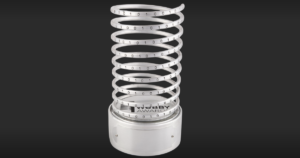
Source: The Webby Award
The Webby trophy is a silver statuette shaped like a spiral, not a simple coil or spring. It is a three-dimensional helix that the Webby organization officially describes as a spiral, and the Webby Group explicitly calls it “creative DNA.” The spiral is wrapped with etched binary code, and the binary pattern spells out Webby when read closely. The object is handcrafted and personalized for each winner, and the original design was made with car parts before the current version was developed. The statuette is light enough that it can bounce when held, which is a known detail mentioned by the Webby group.
The Webby Awards launched in 1996 as the Internet Awards and now cover internet excellence across more than 100 categories, including art and design, coding, film, music, gaming, science, social, creators, apps, software, immersive, and a new AI category. Winners are selected by The International Academy of Digital Arts and Sciences (IADAS), a global organization of industry experts and technology innovators. The online public also chooses The Webby People’s Voice Winners by casting ballots during the annual voting period. That dual system lets the ceremony balance expert judgment with audience participation.
The show is known for its five-word speech rule, which limits acceptance speeches to five words and is enforced as a core part of the experience. The trophy’s spiral form and binary code tie the object directly to the internet, code, and digital culture instead of borrowing from film awards or sports trophies. That connection is built into the design, not added later, so the Webby feels significant without needing to look expensive. The object is not minimal; it is a specific, engineered form with a clear identity tied to the medium it honors.
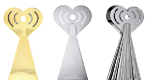
Lovie Awards
Source: Lovie Award / EFX
The Lovie Award trophy is a metallic heart with a pixelated 8-bit edge. That gives it a digital, playful look with a slight retro feel, while the heart shape keeps it warm and approachable rather than severe or corporate. The surface is smooth and reflective, and the edges are clearly stepped to mimic pixels.
It fits the Lovie Awards well because the program sits inside the Webby family and focuses on European digital excellence. The trophy matches that identity by turning a familiar heart into something that feels web-era and design-driven instead of like a generic luxury award. The pixelated edge ties it directly to digital culture.
The object is simple but specific, so it reads as a designed piece rather than a stock trophy. It does not try to imitate a film award or a sports cup. It looks like something made for a digital award that still wants to feel human.
Audio awards recognize excellence in podcasting, radio, audiobooks, and other spoken and produced audio formats. Their trophies often use bold forms and materials to reflect the presence and cultural reach of sound.
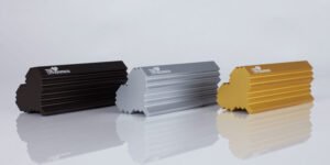
iHeartRadio and iHeartPodcast Awards
Source: Society Awards / Fandom
The main iHeartRadio Music Award trophy is a solid metal sculpture with a rhodium-plated finish, giving it a bright, mirror-like surface. Its smooth, curved shape makes it feel more like a piece of modern design than a traditional figure or crystal block. It has enough weight to feel substantial and permanent in hand.
That rhodium-plated version is specific to the iHeartRadio Music Awards. The iHeartPodcast Awards trophy uses the same overall sculptural shape but is finished differently typically in a polished metal or silver-tone finish without the bright rhodium plating, which makes it more understated and fitting for the podcast side of the brand.
The Titanium Award is also a solid metal trophy, but its finish is more industrial and less mirror-like, designed to feel like a milestone marker rather than a showpiece.
All three trophies are produced by Society Awards, the company behind high-profile entertainment statuettes like the Golden Globe and the MTV Video Music Award. They form the iHeartRadio and iHeartPodcast Awards family, which includes the iHeartRadio Music Awards, the iHeartPodcast Awards, and the Titanium Award. That ecosystem shows how iHeart handles music and audio recognition across different formats under one brand, with each trophy’s finish signaling its role.
The Titanium Award is the most distinct of the group because it recognizes songs that reach one billion total audience spins across iHeartRadio stations. It is not based on a subjective vote; instead, it uses certified Mediabase airplay data multiplied by listener numbers to calculate total audience reach. That makes the Titanium less like a traditional trophy and more like a milestone marker tied to measurable radio performance. Artists such as Justin Bieber have received Titanium honors for crossing that billion-spin threshold.
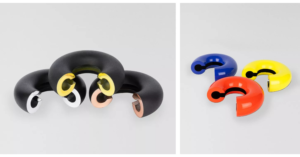
Signal Awards
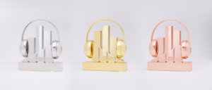
Source: Signal Award
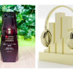
The Signal trophy resembles a pair of headphones wrapped around an audio waveform, finished in polished metal with a clean, modern feel. The form is compact and readable, and it reads as something made for listening, which fits an award for podcasting and audio storytelling.
The award covers shows, limited series, individual episodes, and branded audio work. Podcasting is still building its own awards language, so the trophy has to make the category feel serious without borrowing the look of a film or music prize. The headphone-and-waveform shape does that directly.
Signal was created to recognize podcast types of other awards often left out, including companion and sleep genres. The object does not rely on prestige styling or heavy ornament. It uses the subject matter itself as the shape, which makes the category obvious the moment you see the trophy.
Film awards usually depend on both the trophy and the institution behind it. The best ones look like they belong to the event.
Palme d’Or

Source: The Palme D’OR
The Palme d’Or has been made by Chopard since 1998, after Caroline Scheufele was invited to redesign it by then festival president Pierre Viot. It is built to jewelry standards rather than trophy standards: nineteen leaves in 118 grams of eighteen-carat gold, Fairmined-certified since 2014, on a stem ending in a small heart that references the Chopard symbol.
The leaves are angled to suggest movement, and the piece rests on a rock-crystal cushion cut to resemble an emerald-cut diamond. No two crystals match, so no two Palmes match. It is made by lost-wax casting, weighs about 1.35 kilograms, and takes five artisans roughly forty hours to finish.
The Palme d’Or is deeply tied to Cannes’ identity as one of the world’s most influential film festivals, so the trophy inherits prestige from the event itself. This is the object the generic gold figure pretends to be. The distance between gold plate on a black base and 118 grams of actual gold on actual crystal is the distance between claiming value and containing it.
New York Festivals Trophy
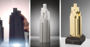
Source: New York Festival Trophy Design / Medium / NYFAdvertising
The New York Festivals trophy was designed by Sagmeister & Walsh and takes its form from New York’s Art Deco towers. The awards come in five tiers, from World’s Best Idea down through the prize levels, cast in aluminum and powder-coated in single colors. A winner who collects several trophies builds an abstract Manhattan skyline on a shelf.
The clever part hides exactly where a stock trophy puts its plaque. A small projector in the base reveals the winner’s name and a list of credits when the trophy is lifted, so everyone who worked on the campaign gets recognized, not just the lead names. New York Festivals president Michael O’Rourke claimed it “smashed the mold for advertising trophies,” and the interactive feature backs that up.
The older design without the bulky base was cleaner and stronger, but the projector adds a functional layer that most trophies do not have. That feature changes the handoff moment into something more theatrical and inclusive. It is a clear example of technology being used to make the award more meaningful.
Gotham Awards

Source: The Gotham Awards
The Gotham Awards trophy is a restrained, contemporary award object that reads more as a clean design piece than a decorative showpiece. Its strength is clarity: the form is kept compact and readable, and later versions became noticeably busier when too much text was added, which weakened the object’s visual discipline.
The award comes from The Gotham Film & Media Institute, which centers independent film and media creators and uses the awards to expand the audience for groundbreaking work. That institutional context helps explain the trophy’s toned-down visual language: it is meant to signal credibility, not spectacle.
The trophy works best when it feels curated and precise rather than overloaded. When text is limited, the object reads as controlled and deliberate. It does not need to compete with the films it honors, and that restraint is the reason it holds up.
The pattern is hard to miss. Ironically, the better known and higher status an award organization becomes, the more likely it is to reflect the trite object described at the beginning of this essay: a gold-plated figure on a chunky black base, aging badly under bright lights. Strip off the name and status and ask if anyone would look twice.
Underneath sits a stubborn misconception that an expensive award must be a valued one. Expense buys neither beauty nor originality. The belief that a good trophy must be expensive is just as wrong; in fact, several of the strongest objects above were built from waste. Most traditional sports cups prove the other half of the argument: they cost a great deal to produce and still look stale and dated.
Organizers like to declare themselves the Oscars of their fields. The trophy usually says otherwise. It is impressive when form, material, and symbolism line up with the idea behind the prize.
The test is simple, and it works whether you are commissioning a trophy or deciding which award deserves your entry fee. Set it on a desk with no label, no context, and no ceremony around it. Does it still tell you something about what it means to win? Every trophy on this list passes. A trophy is the only physical record of a win. If what you are recognizing is worth winning, make the record worth keeping.
Disclaimer: The images used on this page are provided for educational, informational, and commentary purposes only and are believed to fall within the scope of fair use under applicable copyright law. We do not claim ownership of any third-party images, screenshots, official photographs, or other referenced materials. All rights remain with their respective copyright holders.